Top 5 E-commerce Website Design Best Practices 2022

Overview

E-commerce Website Design

No matter how effective your marketing strategies are if your eCommerce website is not optimized for sales, you could be losing key clients. Statistics show that the average time on a page for e-commerce websites is 38 seconds. The layout and style of your website must be enticing enough to hold a shopper’s attention and the checkout process as simple, quick, and stress-free as possible.

In this blog post, we’ll discuss 15 eCommerce web design best practices that would help you increase your conversion rate. Let’s get started.

Keep The Layout Clean And Simple

While it may be tempting to add a lot of visuals, banner ads, and pop-ups, these elements distract a user far away from the end goal of closing a sale. Simple web design with clear navigation and straightforward call-to-action is the basic design requirement for any e-commerce website. From a shopper’s perspective, simplicity means being able to find everything they need on your e-commerce site in one or two clicks. Be it Amazon or Target, straightforward eCommerce web designs have a few things in common. They are:

  • Pleasing color schemes
  • Scannable content
  • Clear navigational components
  • Readable typefaces
  • Stunning Visuals

Mobile-Friendly or Mobile-First Approach

While the terms mobile-friendly websites and mobile-first websites are often used interchangeably, they are two different concepts. A mobile-friendly design means a desktop version of the site is resized and customized to give a better mobile user experience. A mobile-first approach is designing a website prioritizing the needs of mobile users first followed by desktop users. From GenZ or Boomer, people transact every day from smartphones. The competition is stiff in the eCommerce sector and if your website is loading slowly or isn’t responsive, you are sure to lose visitors in less than 4 seconds. To make your eCommerce website mobile-friendly, you would need to optimize the images, layout and the checkout process super-easy. A search box and what’s on sale components grab the visitor’s attention.

Convenient Navigation

Nothing is more annoying than struggling with a website’s navigation. One of the worst things you could do on your website is taking users from screen to screen and offering too many choices or upsells during checkout. Many eCommerce websites fail, not because their offerings are bad but because it is impossible for users to discover what they need as they need to navigate several pages to locate a product.

Add Social Proof

People are more likely to buy something for themselves if they see that others have already done so. Making it easy for buyers to rate and review a product is a great way to engage with your shoppers. Positive reviews automatically build trust among potential clients and also caution them to steer clear of products if their social proof is not a good one. Your eCommerce web design must encourage past clients to upload order images, rate the product and leave a comment. Looking for some social proof on selecting the best eCommerce web design companies to work with? At SolutionChamps, we let our work speak for itself. Check out our portfolio and feel free to discuss your eCommerce project with us.

Entice With Limited-Time Deals

From Daily Deals to Black Friday and Cyber Monday, creating scarcity is a proven marketing traffic to drive conversations. Your eCommerce website design must have an exclusive deals section to entice visitors. Pairing up the limited-time deal with a countdown timer or including an exit-intent pop-up with a discount is a great way to increase your conversion rate.

Final Thoughts

With the right amount of research and planning, creating user-friendly and appealing eCommerce websites that are geared for conversion is definitely worth it. At SolutionChamps, we are here to turn your eCommerce business idea into a visually-appealing, straightforward, uncluttered website built with conversion as focus. Get in touch with us for a quick quote.
Website Redesign Tips and Strategy 2022

The ultimate guide to your website redesign strategy, redesigning your website will help to improve bounce rate, user navigation and layouts.

Overview

Website Redesign Strategy

When should you redesign a website?

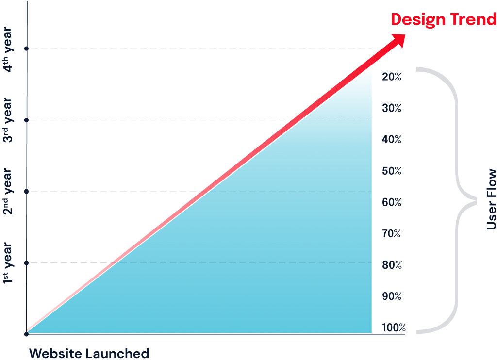
While there is no one size fits all answer to this question, 2 to 3 years is the average timeline that most companies opt for redesign. Below are some obvious signs that your website needs a redesign.

High Bounce Rate

A high bounce rate is one of the key indicators that your website could benefit from a redesign. Bounce rate is the percentage of users who visit only one page on your website before bouncing off to another website. Bounce rates around 40 to 55 percent is a decent figure to aim for. As a website owner, you should be worried if your bounce rate is higher than 70% as this usually indicates that your landing is not meeting your website visitor’s can’t find something on the website. This is a huge sign that you need to design some elements on the landing page or the entire website.

Slow Load Time and Core Web Vitals

One of the fastest ways to repel customers is to have a website that takes too long to load. According to Portent, websites with 0-4 second load time have a better chance of conversion rates. You can measure how quickly your website loads and how to optimize your website using tools like tools.pingdom.com or gtmetrix.com. Another thing to watch out for is your website’s core vitals in Google Search Console. Having a bad core vital score can negatively impact your search engine rankings.

Technology Upgradations

According to a recent survey, more than half of the web traffic originates from mobile devices. If your website is not optimized for mobile devices, you are likely to lose users. Responsive  web design ensures compatibility with multiple devices.

Navigational Difficulties

Have you ever visited a website and scrambled around to look for the information you need?  A website’s navigation is crucial to reducing bounce rate. If the navigation of a website is confusing, visitors won’t stay long or engage with your business. A website with good navigation lets users access key sections of a website in less than three clicks or taps.

To stay Competitive

Design trends change every few years, a good rule of thumb would be to change the design of your website every two or three years. No matter the latest trend, a clean, modern aesthetic website that caters to both mobile and desktop users is the baseline. Tech giants like Google, Microsoft and Apple use a straightforward, minimalistic design approach. While graphic elements help maintain viewer interest and attention, adding a lot of graphics can slow down the website.

How to Create a Website Redesign Strategy

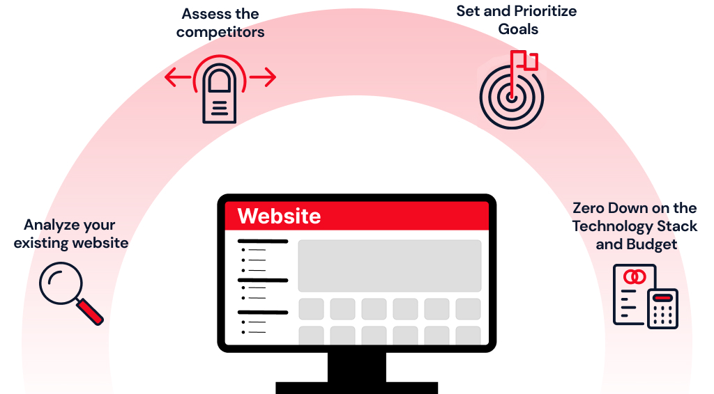
Creating a website redesign strategy requires taking a holistic approach. Here are steps to follow while planning your website redesign.

Analyze your existing website

Understanding what works and what doesn’t work in your existing website is crucial. Start by looking at Google Analytics of your site. Make a note of audience demographics, landing page, device, the bounce rate and average time that a user spends on a page. Compare the pages that are driving you the number of sales to the other pages of your site, inspect every CTA, image and analyze how you would structure the information for growth. You could also use a heatmap tool for behavior analytics.

Assess the competitors

The best way to beat competition is to learn from them. Notice the key elements such as CTA on your competitor’s website, analyze the text, pay attention to the brand voice, the competitor’s SEO strategy among other things. Making a note of the components that are drawing your attention and analyzing their strategy is a great way to understand how you could take advantage of the gaps.

Set and Prioritize Goals

Once you’ve analyzed your current website and competitor website, you will be able to set goals for the redesign. You may need to rework on your content or the brand voice to make it more engaging and informative or you just need to present it better on the landing page. Prioritizing the areas that needs focus sets the tone for your redesign goals.

Zero Down on the Technology Stack and Budget

Are you going to adapt to a newer technology stack or does your website just needs a new look?   You don’t need to upgrade to a newer technology stack just because it is the latest trend. Understanding what works for you and the financial implications of a redesign project doesn’t leave any room for last minute surprises.

Measuring the Success of Your Website Redesign

An improved conversion rate is the ultimate measure of your redesign’s success. It means that more visitors find what they are looking for, the website design appealing and your content is catchy enough to generate sales. Conversion does not always represent a sale of a product or service. It may mean getting a visitor to subscribe to your newsletter or signup for a webinar or even contacting you for a consultation. An optimized website redesign is focused on leading the visitor to the desired conversions. If you notice a spike in conversion rate on your Google Analytics, it denotes that your redesign efforts are a success. A good rule of thumb is to wait at least 3 months after a redesign to compare the conversion rate of old and redesigned versions. Depending on the results, you may want to polish the redesign as necessary to improve conversion rate. Other key parameters include increased number of sessions per user, pages per sessions, average session duration and a decreased bounce rate.

Redesigning a website is a major undertaking that requires careful attention both before and after. Planning to redesign your website? SolutionChamps Technologies is one of the fastest growing web design and development companies in India. Contact us today to kickstart your website redesign.